Skysthelimit.org Onboarding Redesign
Role
Design lead
Focus areas
Research, Strategy, Interactions, Content


Project summary
Sky's the Limit connects underrepresented entrepreneurs with volunteer business professionals for free virtual mentorship. The nonprofit is in late-stage beta, with over 40k signups and global partnerships with Accenture, Goldman Sachs, and PNC.
Objective:
Increase entrepreneurs' registration completion rate from 21% to 33% to maximize signup leads. Info collected in registration feeds core product features and provides demographic stats required for partner/nonprofit reporting.
Role & Team:
I led this project conducting research, ideating initial solutions, running design sprints, regularly updating leadership, prototyping, copywriting, and delivering mobile assets for production. I worked with multiple cross-functional teams, including one technical PM, one data analyst, five engineers, leads from Member Experience and Growth, and one UI designer who produced desktop/tablet versions of the final design.
Before jumping into the redesign, it was essential to understand the context and dependencies behind the then-current version of user registration.
To that end, I created a doc that visualizes back-end processes, CRM outputs, and front-end applications of the data collected. It also captures the business rationale behind each step.

Research methods
To empathize with user motivations around Sky's the Limit, I connected with Growth to see the comms funneling people to signup. Soon after, I met with Member Experience to review any registration feedback collected, given that the team chats with each full member.
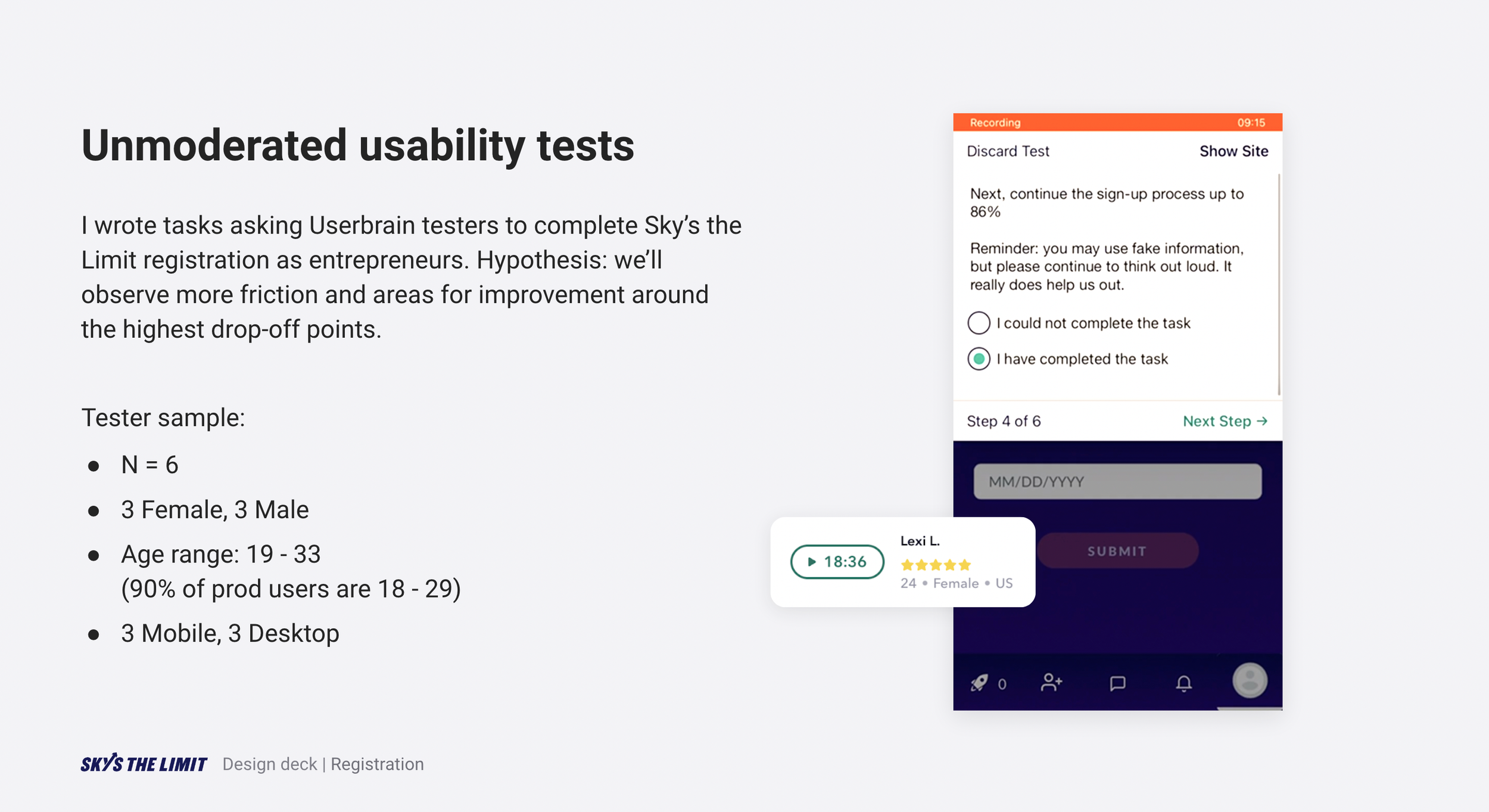
I enlisted our data analyst to identify drop-off points and estimate the average time spent on registration (using a three-month sample). Then, I planned and ran unmoderated usability tests — hypothesizing that we'd observe more friction around the highest drop-off points.
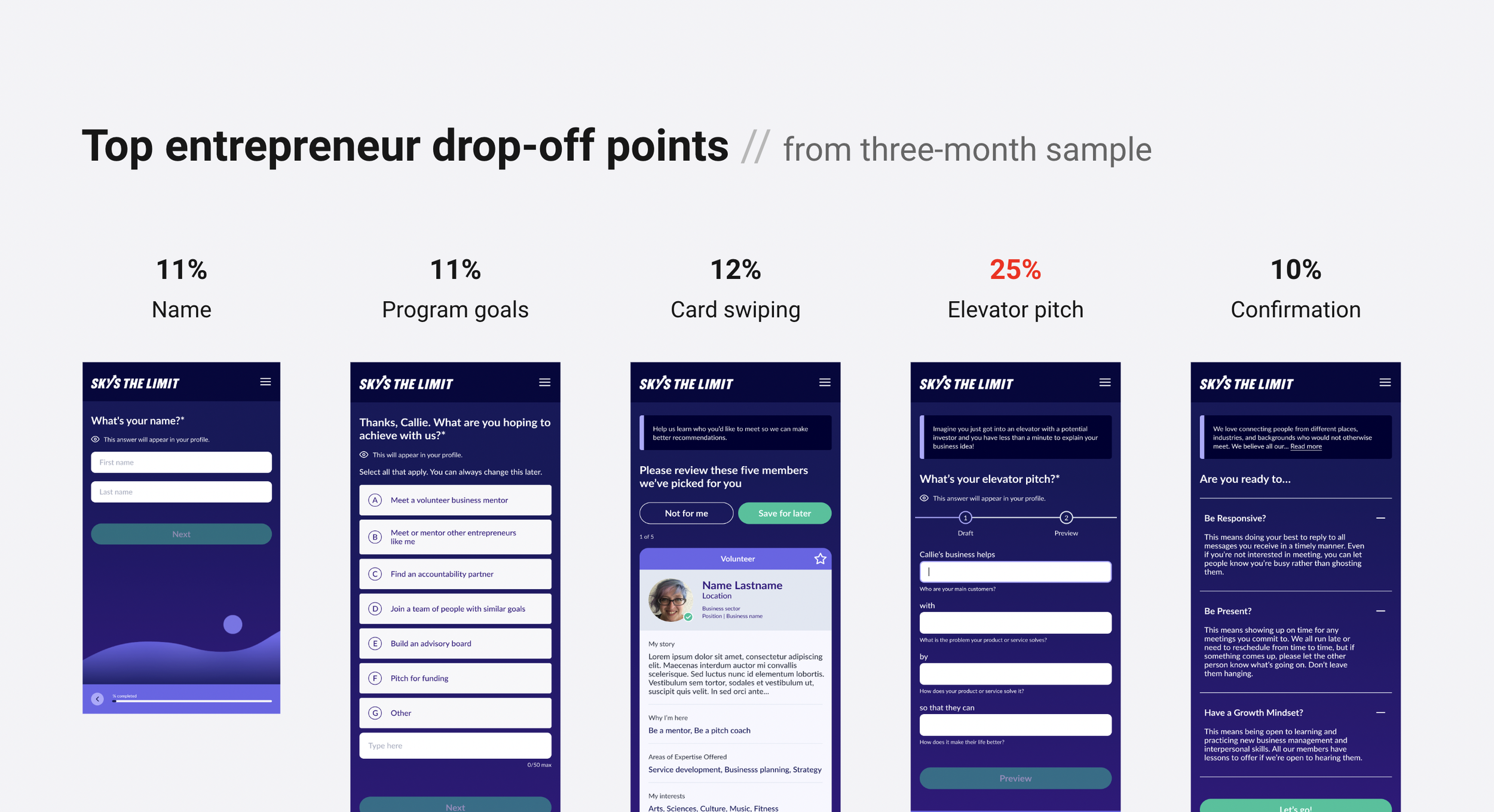
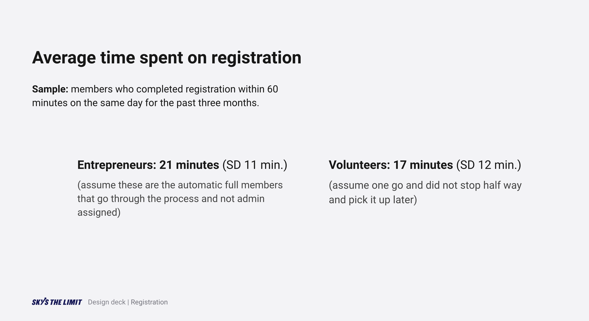
66% of testers voiced concern over the length of registration. Indeed, entrepreneurs in production spent an average of 21 minutes completing it when done in one sitting (SD 11 min.).
Other themes around the highest drop-off points included: hard-to-digest content, unfamiliar UI, and frustration with unexpected interactions.
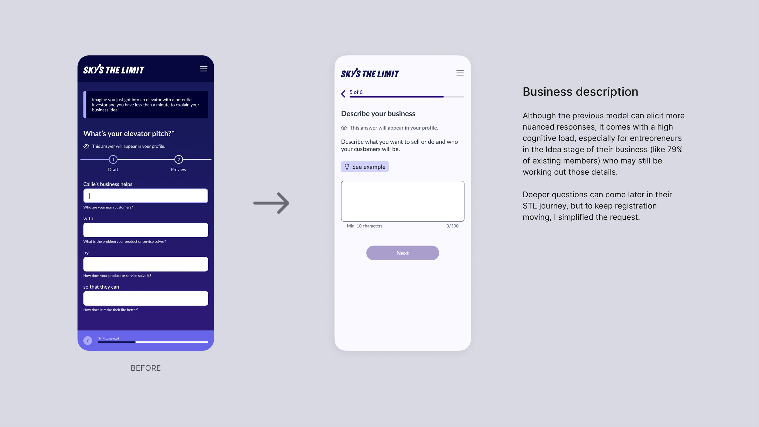
For example, 25% of drop-offs happened on this step which asks entrepreneurs to write a brief description of their business.
Pain points revealed in testing and validated by data
(also reflected in Member Experience feedback)
SOLUTION START
Removing irrelevant steps
Considering research and stakeholder input, I cut unnecessary steps and prompts that could wait till later in the journey. For example, we removed the second-highest drop-off point, which asked users to review recommended profiles halfway through registration.
Tester quote: "How can they recommend people if I haven't said anything about my business?"

The offending step
Creating a new flow
Each step retained from the previous version either serves a core product experience (e.g., matching algorithm) or an essential business purpose (e.g., demographic stats needed for partner reporting). I then explored flows, mapping the experience with dependencies like notifications. Early example:

Final high-level flow
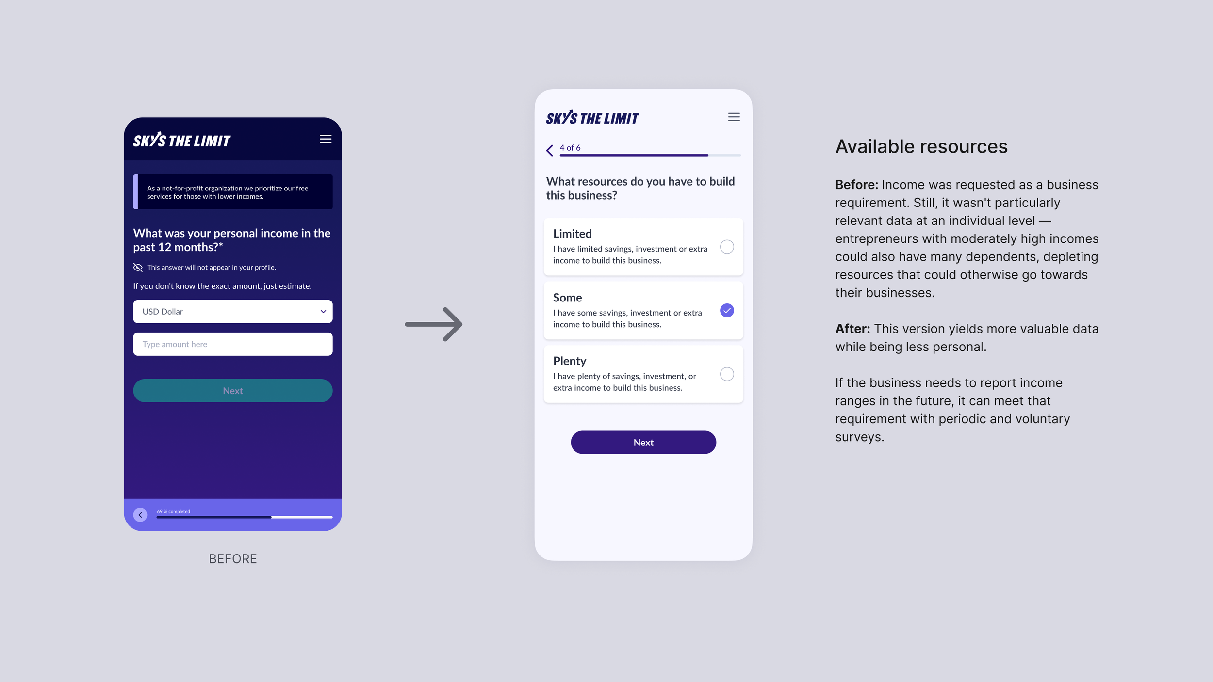
After collecting signup info (name, email, password), this flow groups the remaining fields into three categories to pace the experience — providing more substantial progress feedback between sections (points, content 🎉).


Expanded flow
UI + Content
I created high-fidelity wireframes using the product’s design system to stay agile. I kept the UI minimal and opted for a light theme to match the rest of the platform and brand direction.
Many improvements at this stage came from editing content. I aimed to write clear, concise, and enthusiastic copy — checking for inclusive and accessible language.
See redesign highlights in the following slides.
Prototype & final design
I conducted one more round of unmoderated usability testing (N=5) with a clickable prototype. Testers completed all tasks without difficulty — save for one clear point of hesitation observed with one tester. Taking note of those findings, I got agreement to proceed with the registration update and prepared assets for production.
Three months after release:
The completion rate increased to 40%, exceeding the target set by stakeholders (33%). By improving the registration experience, this iteration moved STL closer to maximizing sign-up leads while preserving the functionality of the previous version.
New highest drop-off point: 36% of entrepreneur drop-offs came from the Product Preview step. Although they ultimately completed registration, one tester struggled with this step when testing the prototype before release.
-
Clickable prototypes
Feature Blueprint v2
Updated recommendation algorithm (sheet)
The logic for Auto-populated Bio (sheet)
Figma Handoff with Yulyn San Lee, UI Designer, Accenture
User Stories with Edwin Valentin, Technical PM, Accenture
Screenshots are available in the Process Deck